SaigonChildren
SaigonChildren is a nonprofit operating in Vietnam running the Big Buddy Little Buddy mentorship program. Their goal is to connect volunteer mentors with low-income, first-generation college students navigating academic and personal challenges without institutional support.
UI/UX
Web Design

Problem & Context
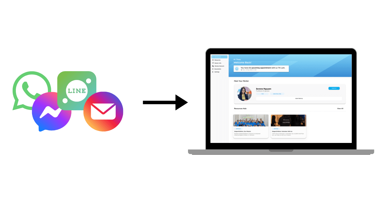
SaigonChildren runs a mentorship program for disadvantaged Vietnamese students, but relied on fragmented communication channels (WhatsApp, Line, Facebook Messenger, email) to manage mentor-mentee pairings and ongoing relationships. With 706 students in training and 62 enrolled in mentoring, manual matching became unsustainable and delayed mentee onboarding.
The platform centralizes three critical workflows: mentor-mentee pairing, profile visibility, and resource access. The core user need is simple: mentees must quickly understand who their mentor is, assess compatibility, and know how to contact them in one place without switching apps. Moreover, user research confirmed this is the primary friction point preventing early engagement.
Research & Discovery
Stakeholder interviews (8 sessions documented) revealed distinct priorities:
Mentees and mentors wanted centralized access to mentor credentials and communication channels; many already preferred Zalo (Vietnamese messaging app) over platform-native messaging.
Admin at SaigonChildren prioritized the matching function itself, which is the ability to filter mentors by profession, save matches, and avoid duplicate or forgotten pairings.
Competitive analysis (3 platforms: MentorCliQ, UCSD Emeriti, ADPList) identified a critical gap: existing solutions either charged fees (exclusionary for disadvantaged youth) or served limited audiences (university-only). SaigonChildren's differentiation had to be free + accessible to non-university students, but this also meant fewer resources for sophisticated features like automated messaging or real-time notifications.
01
MentorCliQ
Strengths
|
AI-driven matching
|
Scalable for large numbers of mentees
|
Structured mentorship options
Limitations
|
Mentees must search for mentors
|
Overwhelming for beginners
|
Not suited for disadvantaged youth
02
UCSD Emeriti Mentor Assocation
Strengths
|
Experienced academic mentors
|
Career and academic alignment
|
Long-term support
Limitations
|
Limited to university students
|
Small-scale
|
No career flexibility outside academics
03
ADPList
Strengths
|
Diverse mentor selection
|
Scalable for large numbers of mentees
|
Free access to mentors
Limitations
|
Short-term interaction
|
Dependent on stable internet access
|
Scheduling conflicts
User personas created from interviews (Big Buddy Minh An, Little Buddy Thu Ha) captured realistic constraints. Mentors had limited weekly time (1 hour minimum); busy professionals. Mentees juggled work, school, and financial stress; needed confidence-building, not task overhead.

Persona A: Big Buddy - Nguyen Minh An
Age: 27
Gender: Male
Location: Ho Chi Minh City, Vietnam
Occupation: Marketing Manager at a Multinational Company
Years of Professional Experience: 7
Education: B.S., Business Administration
Minh An is warm, patient, and passionate about social impact. As a Big Buddy mentor, he guides and supports disadvantaged college students. He dedicates at least one hour per week to his Little Buddy, Thu Ha, mentoring her with career advice, personal growth, and emotional support.
Persona B: Little Buddy - Tran Thu Ha
Age: 19
Gender: Female
Location: Ho Chi Minh City, Vietnam
Education: First-Year University Student - B.S., Accounting
Thu Ha is a determined first-year university student pursuing her Bachelor’s in Accounting, despite financial stress, academic pressure, and uncertainty about her future. She seeks guidance from her Big Buddy mentor, Minh An, to gain confidence, develop skills, and navigate university life.

Gap identified through research: The report documents that users successfully navigated the prototype (found information in < 15 seconds), but feedback revealed a desirability gap. Additionally, participant 2 stated the site felt "incomplete" and lacked "school branding." This shows that the minimal aesthetic undermined the legitimacy.
Design Approach
Iteration A: Playful, Feature-Rich
DESIGN HYPOTHESIS
We hypothesized that a comprehensive feature set: task management, notifications, progress tracking, and community features would increase mentee engagement and provide accountability across the mentorship relationship.

WHAT WE BUILT
Featured widget-based dashboard with progress tracking, task assignments, and notifications. This interface aimed to offer mentors full control over relationship management.
KEY INSIGHT
Scope creep obscured the core user need. Research showed mentees wanted mentor access and not task overhead. By adding sophisticated features, we delayed addressing the primary friction point: making mentor contact and background information instantly discoverable. Furthermore, feedback revealed the interface felt overwhelming and feature-heavy rather than focused.
NEXT ITERATION
Mentor-mentee matching remained to be the core problem. We removed unnecessary features and repositioned mentor information as the dashboard's primary element to test whether mentees' actual need was rapid access to mentor profiles, and not task management.
Iteration B: Mentor-Centric
DESIGN HYPOTHESIS
By repositioning mentor information as the dashboard's dominant element, we could validate whether users' primary friction was information discovery rather than task tracking.

WHAT WE BUILT
Repositioned mentor information as the primary focus on the dashboard. When mentees were paired, they could easily access important information and contact their mentor directly from the main view.
KEY INSIGHT
Stakeholders (Duong Phan, CDO at SaigonChildren) requested further simplification. The dashboard still contained too many components. We had made progress on emphasis but hadn't yet addressed the backend complexity required to maintain all features. The interface had visual hierarchy, but operational clarity was missing. In addition, mentors and mentees needed explicit and scannable pathways to one or two core actions.
NEXT ITERATION
Reintroduce structured task tracking as an engagement mechanism. Create a distinct task management system where mentors can assign tasks, set deadlines, and track progress.
Iteration C: Task Heavy
DESIGN HYPOTHESIS
By moving task management into its own dedicated section, we could maintain structured engagement without cluttering the mentor-discovery flow.
Task tracking with deadlines, progress bars, and completion status would keep mentees accountable while reducing cognitive load on the main dashboard.


WHAT WE BUILT
Reintroduced task tracking as a structured engagement mechanism. Mentors could assign tasks, set deadlines, and track progress. Each task displayed completion status and progress bars, giving mentees clear visibility into their assignments and accountability.
KEY INSIGHT
The backend complexity required to support task management, progress tracking, and data persistence exceeded our development capacity within the project timeline.
NEXT ITERATION
The task management backend proved too complex for our timeline. Return to the simplified approach. Strip the interface to essentials: mentor profiles, resources, and document management only.
Iteration D: Simplified & Scalable

WHAT WE BUILT
The final simplified version stripped to essentials. Mentees accessed mentor profiles with background and expertise, a resources hub for guides and materials, and a documents section for uploading reports and files. Navigation was intuitive with a clear sidebar and straightforward information hierarchy.
KEY INSIGHT
Constraints forced clarity. By removing task management, notifications, and real-time messaging, the platform became more scalable and maintainable. The minimal interface strengthened the core value proposition: fast mentor-mentee connection without friction.
NEXT ITERATION
This version serves as the foundation for future iterations. Task management, messaging, and notifications can be layered in once the backend infrastructure and team capacity allow. The stripped approach prioritizes implementation over feature completeness.
Outcome & Impact
Usability Validation
3/3 users | 4 Tasks | 12 seconds
Task Tested:
|
Find Information About Your Mentor
|
Access Helpful Resources
|
Check Your Assigned Tasks
|
Connect with Other Mentees
What This Proved:
Information architecture works as intended but visual identity needs strengthening to communicate mentorship experience
With core usability proven, adoption becomes the critical measure.
To move from prototype to production, we'd test:
Primary (User Research):
|
Real-world testing with Vietnamese-speaking mentees
|
Mentor-mentee retention over 6+ months
|
Resource hub adoption and actual usage patterns
Secondary (Technical Validation):
|
Backend scaling for concurrent users
|
Platform reliability & communication flows (Zalo integration)
Reflection
WHAT WORKED
WHAT WOULD CHANGE